
Product design for a mobile app
Client: Personal
Type: Apps, Card Sorting, Competitor Analysis, Content Design, Information Architecture, Personas, Prototyping, The Arts, User Research, User Stories, User Testing, UX Writing, Wireframing

Task
As a UX writer, I knew I needed to go through the UX design process if I wanted to work with a UX team. So I used the UX process to design my own app. Time to Write is a conceptual mobile application that helps fiction writers stick to their writing schedule, even when they are feeling tired, unmotivated, or distracted.
Challenge
To do all the UX roles involved in designing an app.
Process
Ideation, user research, competitor analysis, personas, user stories, information architecture, card sorting, wireframing, prototyping, user testing, and of course, all the UX writing.
Tools
Adobe XD, Miro, Canva, Adobe Photoshop, Draw.io, Optimal Sort
Results
108 mobile screens for Android, a high-fidelity prototype, and some very interested user testers who asked, “When can I download this? I need this!”
Takeaways
Stepping into the role of a UX Designer/Researcher was fun and challenging. The project renewed my respect for all the brilliant designers, engineers, and researchers out there! Keep reading to get all the details, including screenshots, empathy maps, personas, etc.
Starting the UX Process: User Research Survey
The idea was born after fiction writers told me that they often missed their daily writing sessions despite fully intending to write that day. To learn more about the issue, I surveyed 22 fiction writers about their writing habits and challenges. I also did in-depth interviews with four of the survey respondents.
The respondents’ pain points could be summarized as:
- Even though I have a writing practice established, at some point I fall off the wagon.
- Sticking to my writing practice is usually hard! I have to devote so much energy to my job or family. When it’s easy, it’s because I’m enthusiastic about what I’m writing, or have supportive friends and fellow writers.
- I typically fail to stick to my schedule when my job gets busy, when I’m emotionally upset, or when I’m distracted by fun things.
- When I fail to stick to my schedule, I feel mad, stressed, frustrated, and depressed.
Initially, I thought writers might be struggling with inspiration issues. Were they getting off track because they ran out of ideas or didn’t feel inspired to write?
The results showed that a lack of inspiration wasn’t the main problem. Interruptions were.
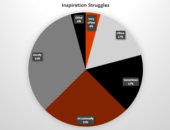
Inspiration Struggles among surveyed fiction writers
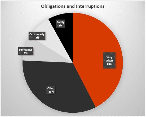
Obligations & interruptions among surveyed fiction writers
When asked how a mobile app could help with these issues, the respondents said the app could provide:
- Reminders such as
- It’s time to write!
- Here’s where you left off.
- Here’s why you were excited about writing this part.
- A way to immediately capture and tag spur-of-the-moment ideas
- Rewards and gamification
- Progress updates to accountability partners or writing groups
Competitive Analysis
Did an app like that already exist? During a competitive analysis, I was unable to find any apps that met the users’ needs. I found apps designed for manuscript management (Scrivener), websites meant to track word counts and build writer communities (750Words.com), apps meant for building good habits (Habitify), and apps meant for journaling (DayOne). These apps and sites met one or two of the users’ needs, but none encompassed all the needs. None were geared toward motivation and daily schedules for fiction writers. So, I saw a need for a new app.
The writers I interviewed wanted a clean and simple interface. 750words.com was a little too busy due to the complexity of its functions. However, DayOne gave me great inspiration because of the app’s ease of use and simple design. I also liked Habitify’s clean interface.
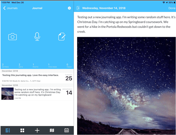
Day One app

Habitify app
Empathizing with the User
Based on the user research needs, I developed a persona that covered the needs, goals, behaviors, and frustrations of the fiction writers I had interviewed. I chose a working mother, since many of the writers often had competing demands from work and family. I also made an empathy map of what the persona thought, felt, said, felt, saw and heard in her daily life as a writer.
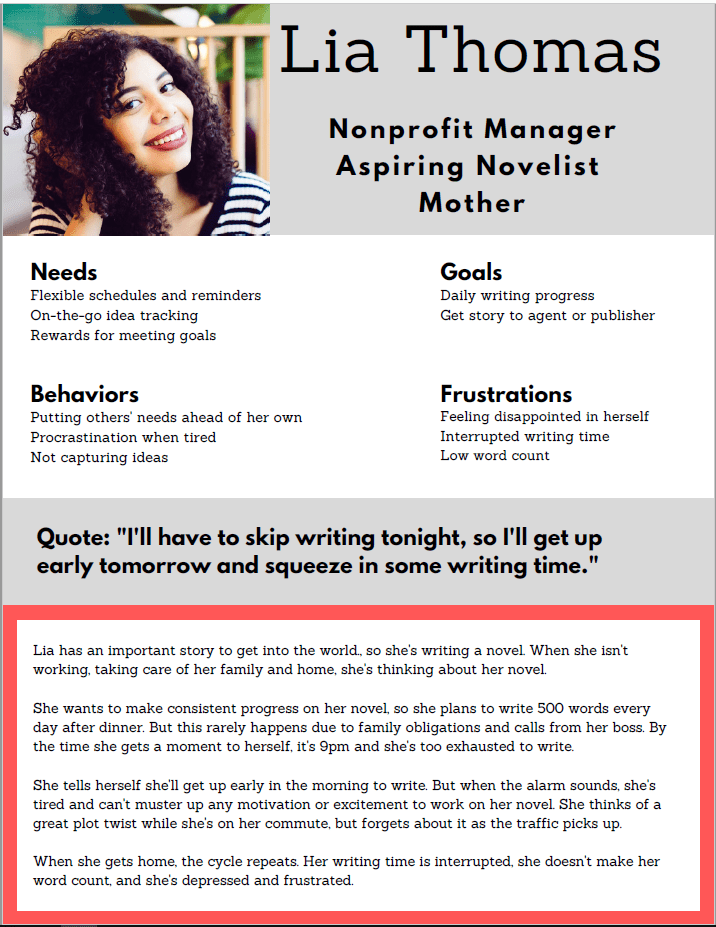
Persona: Lia Thomas
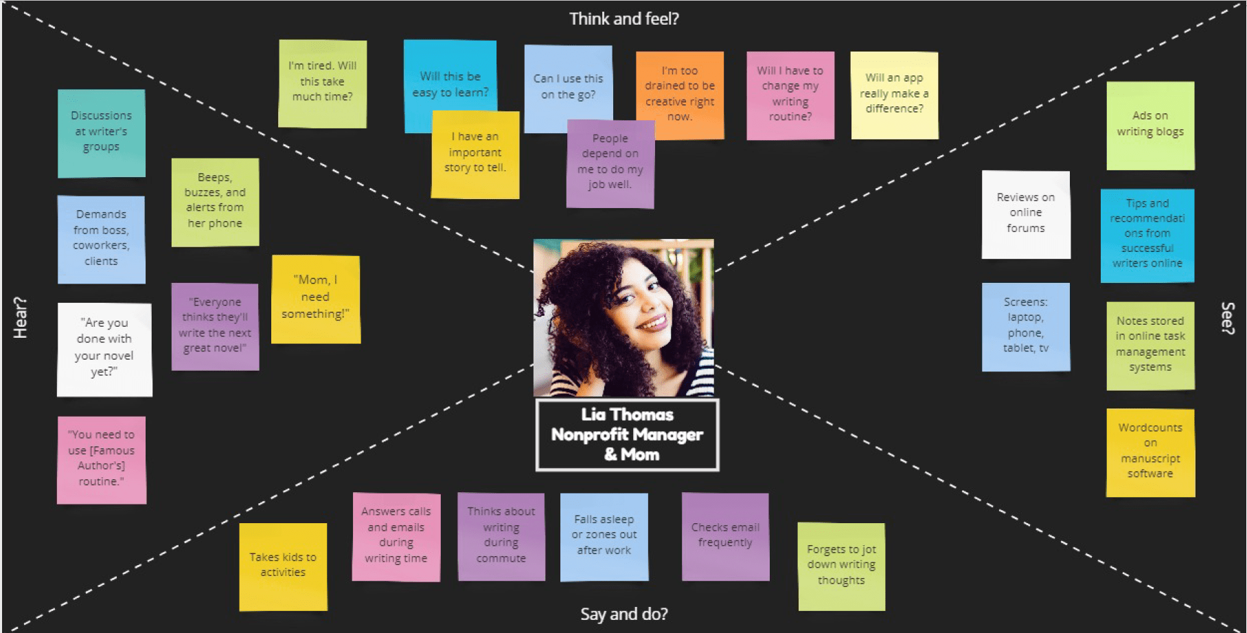
Empathy Map: Lia Thomas
User Stories
I also created a spreadsheet of User Stories: 29 actions a user would want to do with an app geared toward helping fiction writers stay motivated and on-schedule. Some examples of the stories and their related requirements:
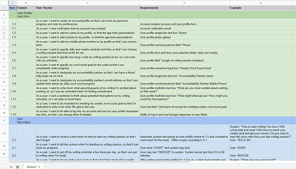
User Stories
Information Architecture
By this point, I was getting an idea of the type of app that would be most useful to users. The user stories helped me build a potential sitemap along with several user flows.
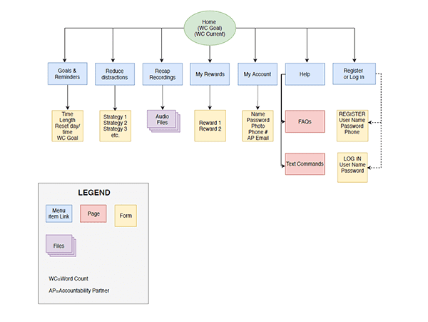
Initial Sitemap
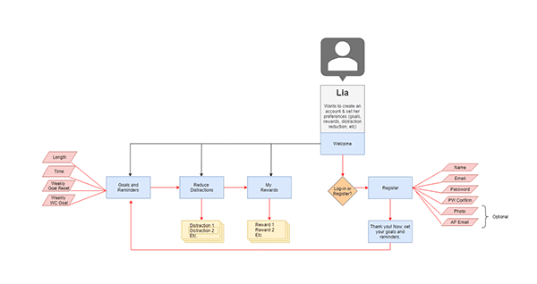
A user flow
Card Sort
To test my sitemap categorization, I did a remote, closed card sort to see how users categorized some of the user stories. After studying the results, I ended up removing a category, renaming some other categories, and placing a Word Count feature front and center on the home page, instead of burying it in a category that no users thought to look in.
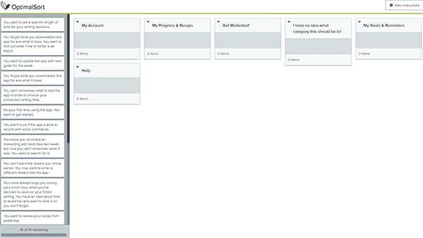
Card Sort created with Optimal Sort
Beginning the App Design
I created some paper Sketches of an initial app design. Working on paper in the initial stages allowed me to get messy, scribbling and erasing as needed. The sketches helped me draft some wireframes in Adobe XD. The wireframes were initially built with the idea that the app would use interactive push messages, but a simpler alternative was to have a push message or SMS message sent to the user, reminding them to open the app.
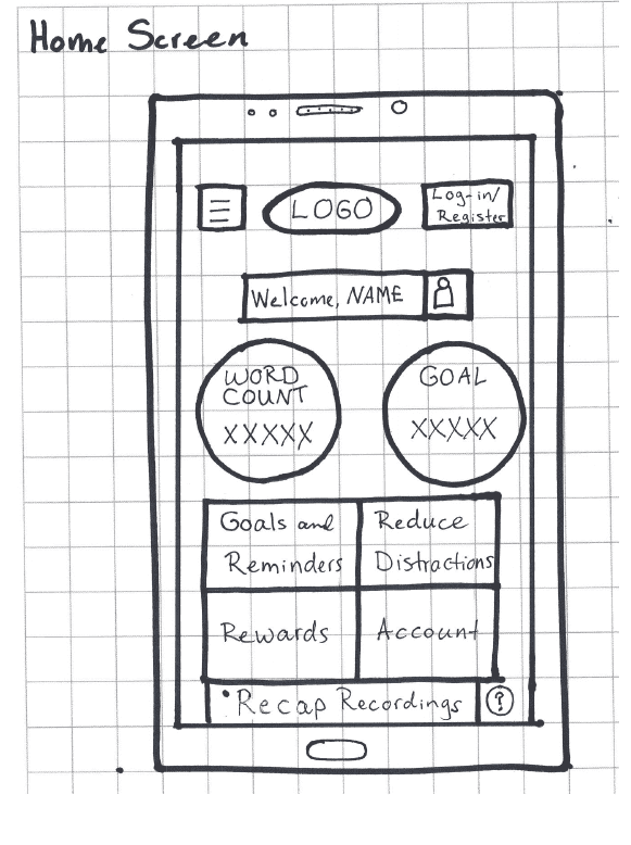
Sample Sketch 1

Sample Sketch 2
Wireframes created with Adobe XD
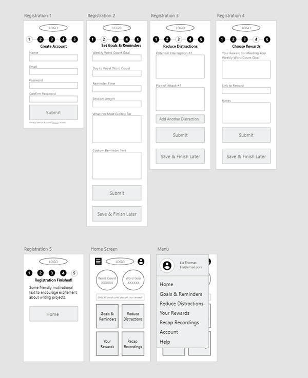
Making a Prototype
With Adobe XD, I created a clickable prototype as well as a style guide. Screenshots are below. The app
- sends reminders when it’s time to start a writing session
- helps the user anticipate and avoid distractions and interruptions
- allows users to pick their own reward for staying on track
- sends automatic updates to an accountability partner
- records progress notes and spur-of-the-moment ideas
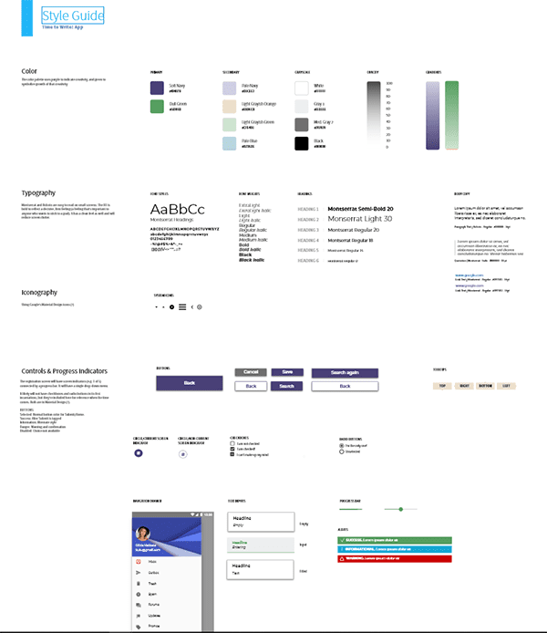
The style guide


The style guide
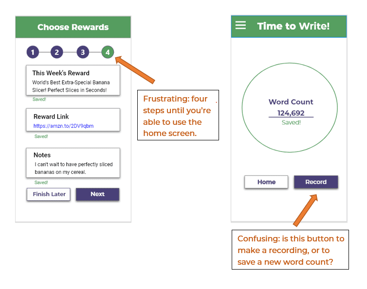
Usability Testing
I tested the app with five users, all who had been part of the survey or interviews. Overall, participants felt the app was easy to use. They liked the simplicity of the layout and the big circles and squares on the home page.
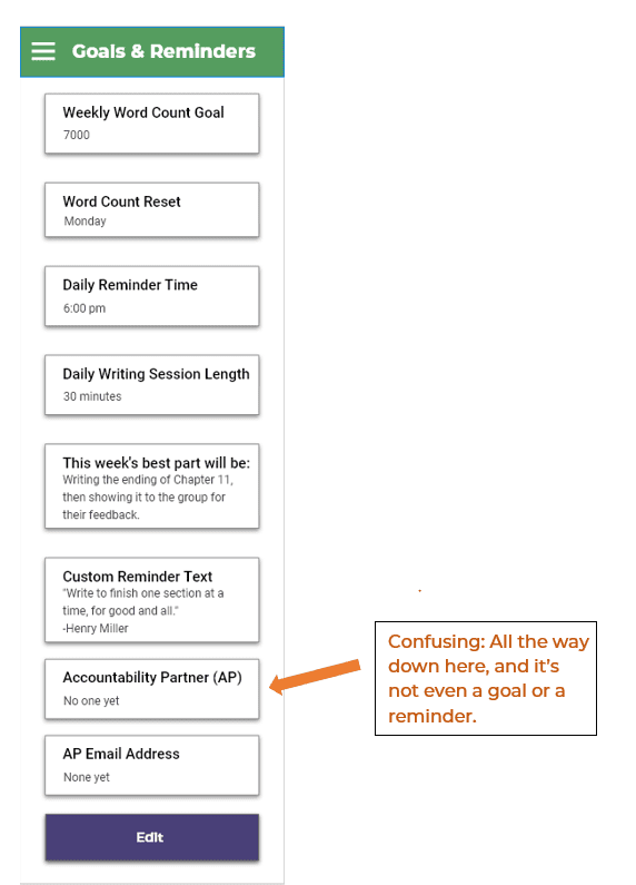
- All participants weren’t sure where to look for the accountability partner section. Most looked for it in the navigation drawer.
- Most users wanted the set-up to be separate from the registration process. They wanted to create an account with their email and password, log in, and then go straight to the home page to explore. They wanted to do the set-up (selecting rewards, entering distractions, etc.) later.
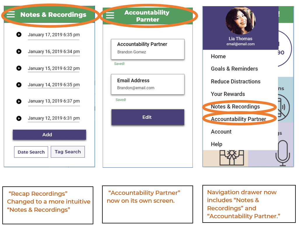
- The term “Recap Recording” didn’t feel right to some people. Some people said they’d want to add a voice note that wasn’t attached to a writing session (and therefore not a “recap.”) It also confused some people who thought the “Record” button meant “Save.”
- One user wanted a scroll bar and a back arrow.
- Tooltips to explain what the features do would be helpful. Users eventually figured out the purpose of the features, but tooltips would have sped up the process.
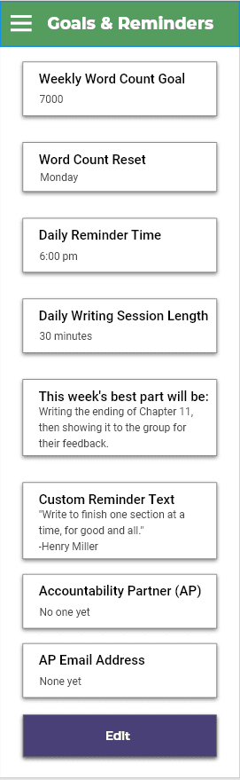
A few screenshots of trouble areas are below.
What’s next for this app?
Based on the usability testing, some changes are in development:
- Move “Accountability Partner” to the navigation drawer.
- Simplify the registration and created a notification on logging in, prompting users to set up their goals, reminders, and rewards, and plans of attack.
- Change “Recap Recording” to Notes.
- Add tooltips.

Want to see more of Time to Write? View the updated app prototype here.