Streamlined navigation: UX research in higher education
Client: University of California
Type: Advertisements, Healthcare, User Research, Web Management
Task
A university student health center needed data on how students consumed health information to inform an upcoming content strategy. I proposed and led a user research initiative to gather this data through a comprehensive survey.
Challenges
- The content changes needed to align with existing CMS constraints.
- It was the first UX research initiative for the department.
Tools
Survey Monkey, Photoshop, Canva, and Cascade CMS
Process
- Led end-to-end survey development, including research design and analysis
- Conducted market research on effective survey methodologies for university students
- Collaborated with clinicians and health center staff to develop survey questions, an outreach strategy, and incentives
- Ensured compliance with University Institutional Review Board requirements
- Engaged Student Advisory Board to validate research approach
- Implemented multi-channel survey promotion (social media, flyers, emails, etc.)
- Developed content strategy based on research findings
Results
The survey data revealed key insights that shaped our content strategy:
- Email emerged as students’ preferred communication channel, leading to the development of an email-first content distribution approach.
- Students consumed health center content through established campus social media accounts rather than following healthcare-specific accounts. This insight led to content partnerships with high-traffic university channels.
- User feedback identified specific content organization needs on the website, informing our information architecture decisions, and method of communications (e.g. they asked for more infographics).
Strategic recommendations
Research showed students’ top three information priorities were appointment booking, hours/location, and services. I recommended:
- Restructuring homepage information architecture to surface highest-priority content.
- Developing plain language guidelines for medical service descriptions.
- Creating content templates to ensure consistent information hierarchy.
- Establishing content governance processes for ongoing updates.
- Evaluating the site for infographic potential.
- Updating the menu design for consistency, readability, and branding, with users’ greatest needs at the top level.
Before and after sample: Menu on homepage
I created the structure, content, and graphics for a new main menu block.
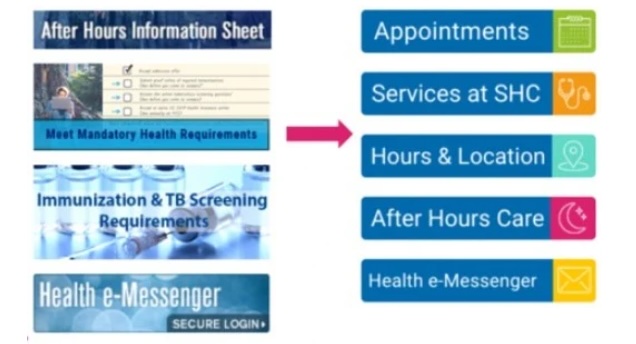
Before:
- Generic categories and administrative labels at top level
- Complex language
- No branding colors
- Buttons in different sizes
After:
- Primary user tasks surfaced at top level
- Simplified language
- Branded colors
- Button sizes standardized
Takeaways
- Aligned digital content with documented user needs
- Established data-driven processes for content decisions
- Created replicable research methodology for future content initiatives
- Improved information findability through user-validated rankings