Improved instructions: Student healthcare compliance
Client: A department within the University of California system
Type: Content Design, Healthcare
Task
A university needed to improve students’ understanding of immunization hold procedures. These holds prevented class enrollment when immunization requirements weren’t met, and both compliance rates and support tickets indicated students struggled with the removal process. I began an overhaul of the webpages.
Challenges
- Limited CMS functionality: Solutions had to work within basic HTML.
- Unintuitive navigation: Critical enrollment hold information was difficult for students to find, as the info was located on the Immunization page, which already had a lot of content.
- Users’ emotional states: Research showed that enrollment holds created high-stress situations for students, impacting their ability to process complex instructions.
Tools
Photoshop, Canva, Cascade CMS, HTML
Process
- User journey and flow analysis: Multiple navigation steps and a downloadable document created friction points in accessing hold information.
- Content audit: A careful review of content showed significant issues, such as:
- Instructions used legacy terminology and long paragraphs.
- Search terms didn’t match student vocabulary (e.g., website used “compliance checklist” while students searched for “fix enrollment hold”).
- No clear step-by-step guidance existed.
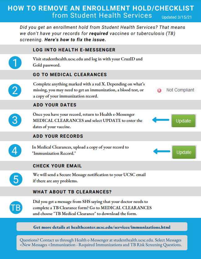
- Stakeholder interviews: Clinical and systems staff outlined the complete hold-removal process, clarifying the outliers that needed extra callouts. For instance, the process for tuberculosis screenings was significantly different than the other requirements.
- User research: I interviewed the Student Advisory Board about their experiences and perceptions of the process and the instructions, extract themes to inform my strategy.
Results
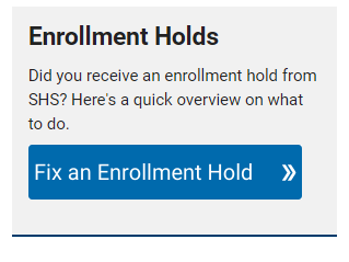
1) Adjusted the page hierarchy: I added a prominent “Fix Enrollment Hold” button at the Immunization page’s primary entry point.
2) Created a step-by-step infographic: This visual format highlighted key patient portal interactions, visible when the student selected the “Fix an Enrollment Hold” button.
Impact and Takeaway
- Support staff reported a reduction in student inquiries after implementation.
- Student Advisory Board testing confirmed improved clarity and usability.
- Process successfully balanced compliance requirements with user needs.
- Future opportunity identified: Optimizing the infographic for mobile viewing, as many students access university resources on their phones.